
Art in Science Exhibit Hall
Click on the thumbnails to view full-scale
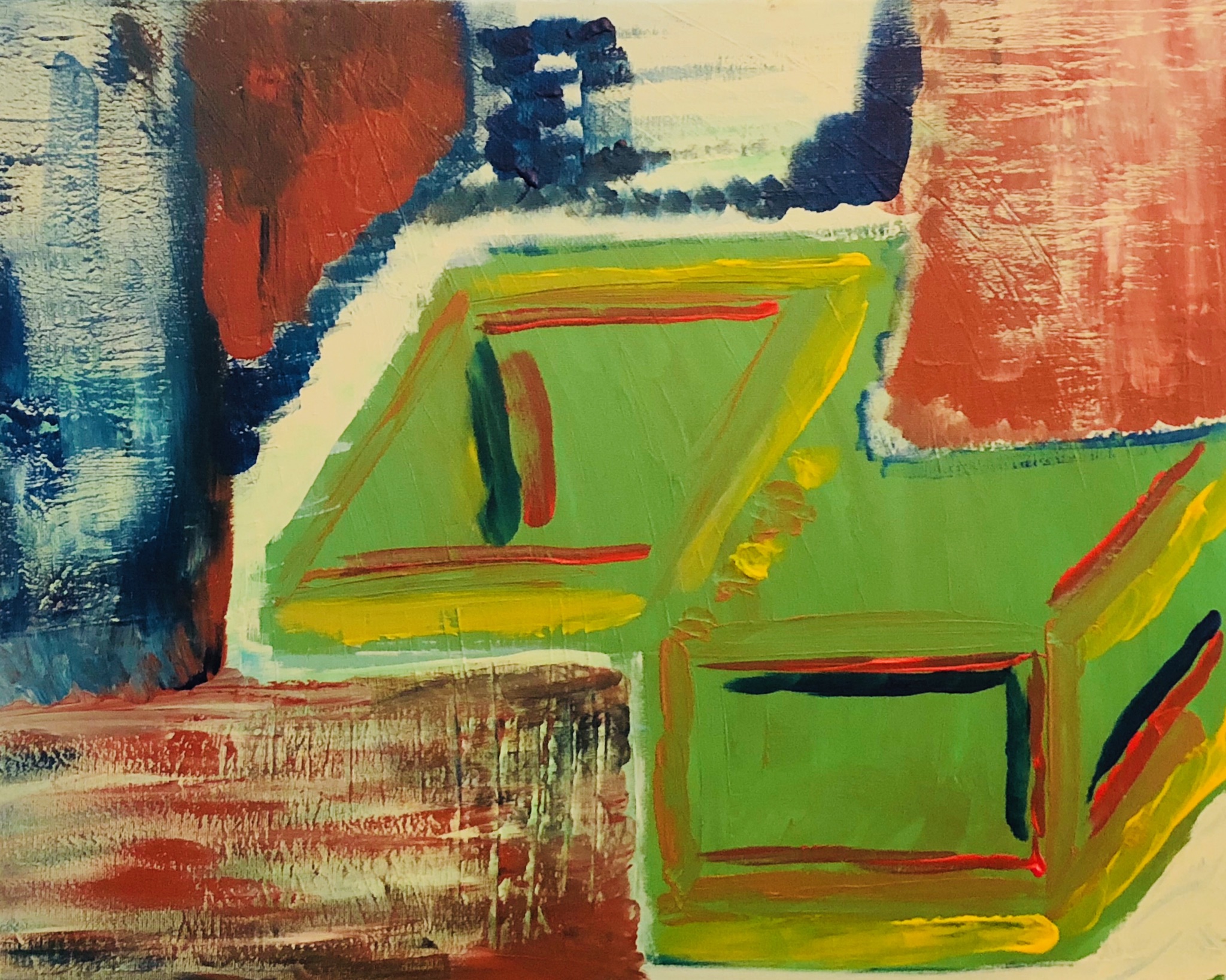
Art of Epigenetics, Zdenko Herceg, Mixed media canvas painting (162x130 cm) 2020
by Dr. Zdenko Herceg
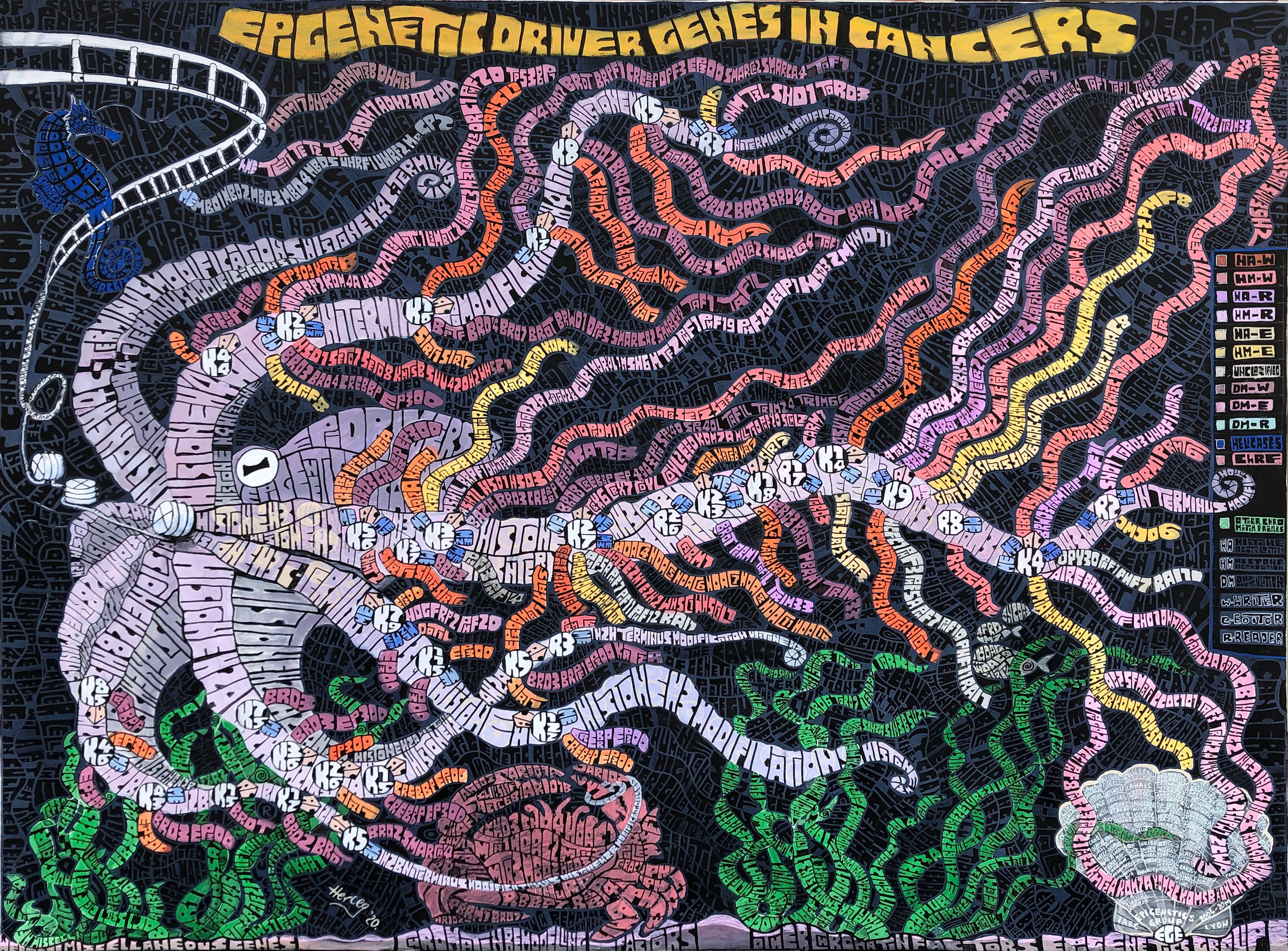 Science and Art are two sisters born to passion, the one choosing a relentless quest for truth and the other opting for eternal search of beauty and meaning. Sisterly encounters, even though rare, are impregnated with creative tensions and inspiring alliances poised to reveal secrets of life. Epigenetics is art of interpreting the genetic code where epigenetic modifying enzymes impersonate the artists that use a panoply of colors, forms and shapes to decrypt the DNA heritage and to portray molecular imprints of nature and nurture. United in an art club, the writers (HA-W, HM-W and DM-W), readers (HA-R, HM-R and DM-R) and editors (HA-E, HM-E and DM-E) dynamically brush the tentacles of the epigenetic octopus (octamer of histones) that embodies the diversity, adaptability, mystery and intelligence. We are taking a deep dive to unveil the buried treasure map decoding the language of our genes and diary imprinted by our life and environment in a fascinating story of underwater adventures (aqueous state of the cell) to uncover the shelter hiding the cancer and the shell safeguarding those willing to take the adventure.
Impact
by Mr. Joshua Bugbee
 The multi-dimensional effects of COVID-19. Our world has been changed forever.
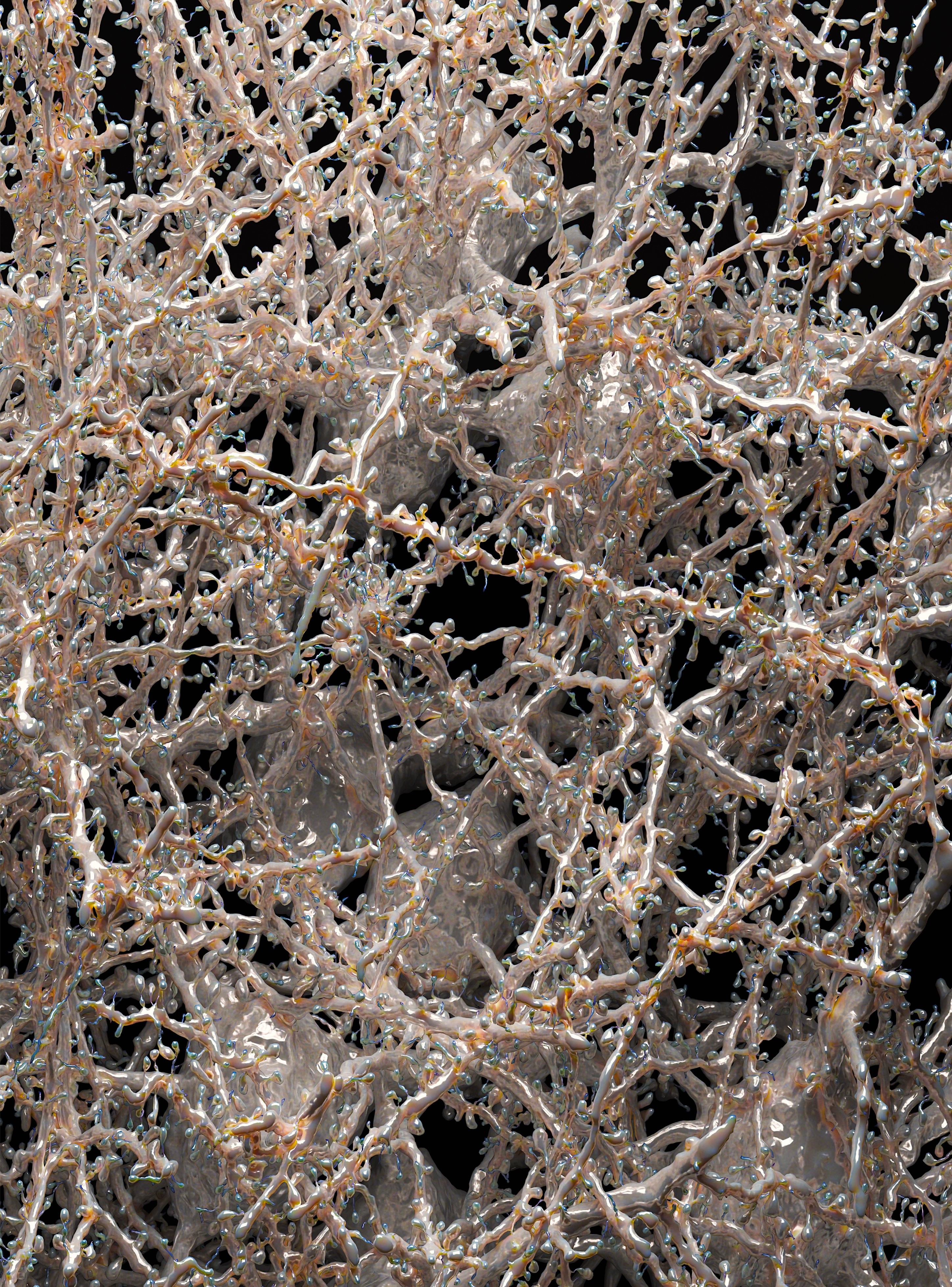
Brain Vasculature
by Dr. Marwan Abdellah
 An artistic rendering of a digital reconstruction of the human brain arterial arborizations.
Dataset is available from the Brain Vasculature (BraVa) database. The mesh reconstruction is performed with NeuroMorphoVis and the rendering is obtained with Cycles.
Genome Graphs
by Mr. David Twesigomwe
 The concept of graphs was born from the intriguing Königsberg bridge math problem. Currently, there is an ongoing paradigm shift in genetic variant detection, characterised by applying the concept of graphs to create reference pangenomes rather than relying on linear reference sequences.
Even though standard approaches for detecting small nucleotide changes as well as structural variants based on alignment to linear reference genomes have largely been successful, they face a number of limitations. Linear reference genomes are not representative of a number of minority world populations. Their structure does not allow for capturing genetic diversity especially in complex genomic regions. They also present a challenge of reference allele bias during read mapping as well as potential misalignments around indels.
Genome graphs offer an interesting solution to these challenges by enabling augmentation of linear references with virtually any form of variation using nodes connected by edges as shown in this artwork. In this way, various alleles in a population can be represented as paths in the graph thus allowing for better read mapping and variant detection.
This artwork was produced using an open source graphical assembly visualisation tool called ‘Bandage’ (https://rrwick.github.io/Bandage/)
Tumor Biomarker Heatmap
by Mr. Joshua Bugbee
 This is no ordinary heatmap, this takes into consideration the trajectories of change for given biomarkers, better producing a clear picture of the dynamics within a tumor microenvironment.
Logic Gates
by Mr. Joshua Bugbee
 The use of these tools are absolutely necessary to fold into our everyday instruments to evaluate such complex processes - especially under the auspices of complex adaptive systems and the importance of state changes regarding dynamic temporal events.
Tensor Decomposition
by Joshua Bugbee
 The use of tensors is just getting started. Revealing insights into more complex biological processes is a cornerstone. This simplistic rendition of that fact is not to minimize what they do at present, but to foreshadow what they will help reveal in the future.
listen
by Mr. Joshua Bugbee
 It is challenging to arrive at the true signal present amongst a deluge of noise. Listen closely.
Nash
by Mr. Joshua Bugbee
 Notions such as game theory need to be superimposed onto our observations of cancer treatments to really understand the economic truites associated with these systems and subsystems and how we can better exploit the flaws that will lead us to saving more lives, faster.
Barchart Deconstruction
by Mr. Joshua Bugbee
 The simplistic use of various tools like barcharts are evolving into more complex ways of understanding higher dimensional data. While science itself evolves, so must the metrics that we use.
Robust Network
by Mr. Joshua Bugbee
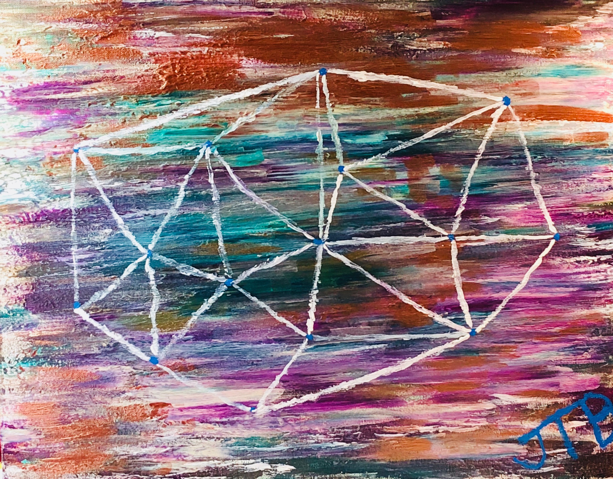 Despite the perturbations provoking various systems, robust networks emerge and evolve. The underlying dynamics of the perturbations and how said system reacts can be observed at varying scales of the network, allowing the creation of more effective therapeutic mechanisms.
Nodal Interference
by Mr. Joshua Bugbee
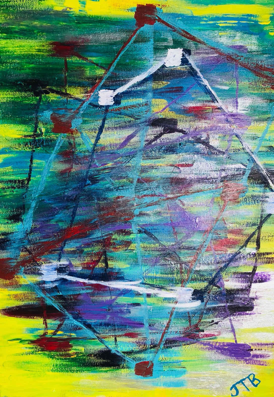 The interpretation and mechanistic understanding of the blockage of various driver nodes within a system, like the energy transduction systems of various cancers, will lead to better enhanced precision therapeutics regarding tumor clonal evolution and associated treatment strategies.
Avatars of breast cancer cells
by Dr. Heba Sailem
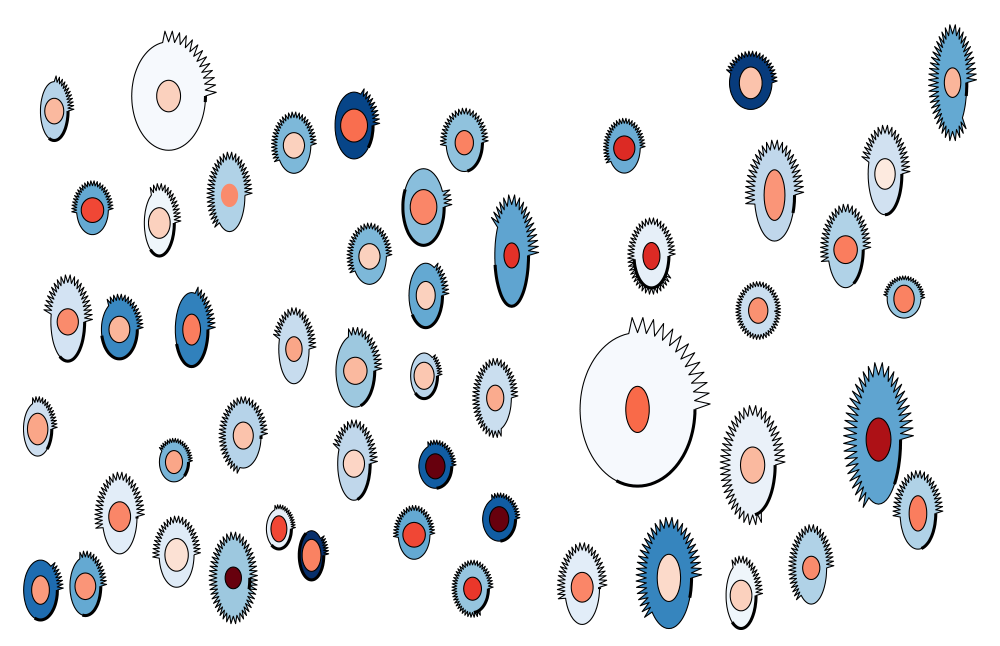 Cancer cells are highly heterogenous even when they share the same genetic background. Here we illustrate the morphological heterogeneity of breast cancer cells using PhenoPlot. PhenoPlot is an automated visualisation tool that draws a quantitative pictorial representation (avatars) of cells based on the quantification of thousands of cells. We represent various shape features of single breast cancer MCF7 cells are represented to demonstrate their heterogeneity. The dimensions of cells and their nuclei are reflected in ellipse height and width. The irregularity in the cell membrane is represented by the extent of the jagged line surrounding the ellipse. The thick part of the cell border reflects the extent of cell-cell contact. The intensity of DAPI (nuclear marker) and DHE (cytoplasmic marker) are represented using colour hues. Collectively nine dimensions are represented. PhenoPlot can be an effective science communication tool as it simplifies complex data to lay audience.
Protein 2D structures
by Mr. Aleix Lafita-Masip
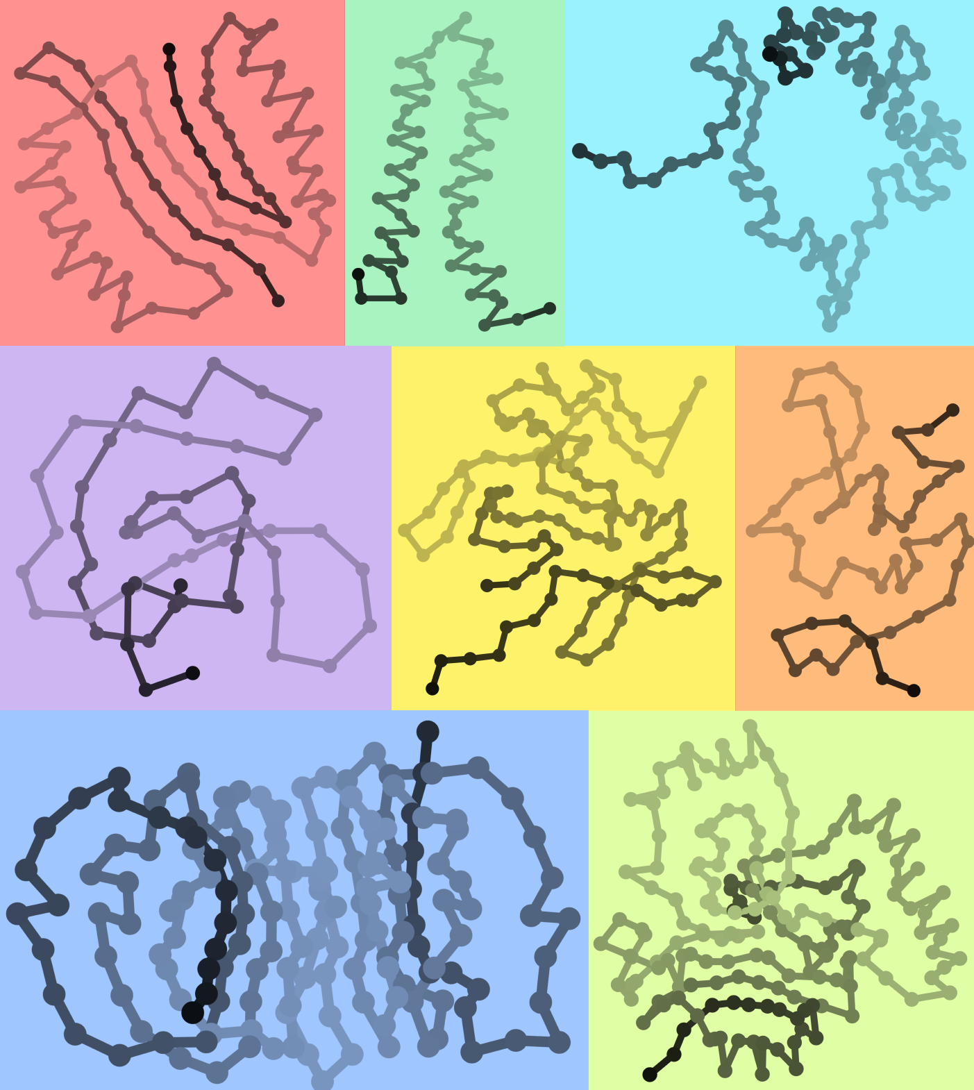 Proteins fold into complicated three dimensional molecules. As we also happen to exist in 3D, we feel the need to rotate them around in our 2D computer screens all the time. Commonly, our goal is to see which residues of the protein interact and how the protein chain is threaded, so we can compare different proteins and understand their function. Would it not be easier if protein structures were in two dimensions?
Here, I used a slight variation of our protein modelling approach based on Euclidean Distance Matrices (EDMs) to produce 2D structures of proteins. Preserving only close distances between residues in the protein distance matrix, it is possible to apply a technique known as multidimensional scaling to map atomic coordinates in 2D. The resulting structures preserve information on residue interactions and fold topology, useful for protein structure analysis, with the advantage of being in two dimensions.
Do you recognise any of these domain folds?
Coiling and Clustering
by Robin Aguilar
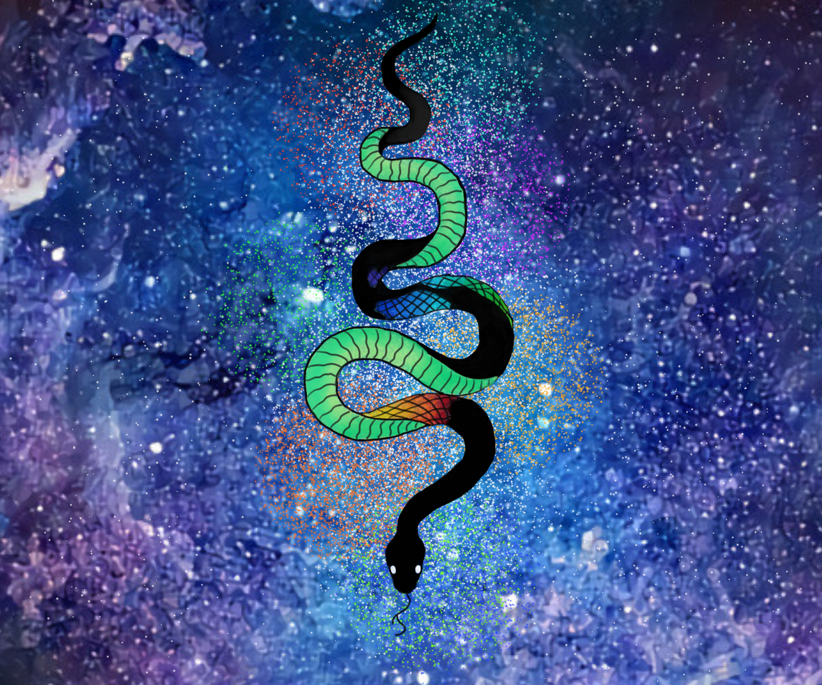 Observing data trends leads to new questions and inspires discovery. Data visualization tools have many applications and implications in the field of bioinformatics. In this piece, "Coiling and Clustering", many techniques of data visualization are highlighted. The watercolor galaxy background was created by a Generative Adversial Network (GAN) trained with space and galaxy images that were merged with super resolution microscopy and watercolor textures. GANs have been applied to the field of bioinformatics to learn new insights on gene expression profiles and how the genome is organized. The clusters of multicolored dots represent the concept of dimensional reduction such as those presented in clustering methods like UMAP/t-SNE projections of single cell measurements. And lastly, the snake featured is a python, representing a common language and ground used by researchers for extensive data science and bioinformatics applications.
Diving into the Visual Cortex
by Dr. Marwan Abdellah
 In silico visualization of a little block of neurons reconstructed from the visual cortex of the 36-day-old mouse with electron microscopy.
The dataset is available from:
Seung Lab - Princeton University
Brain-map.org - Allen Institute for Brain Science
Tolias Lab - Baylor College of Medicine
IARPA Microns
Brain Vasculature
by Dr. Marwan Abdellah
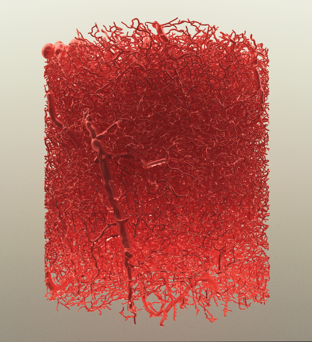 A high-quality rendering of a large vasculature mesh generated from a vascular graph of a mouse brain. The image is created automatically with VessMorphoVis (BioVis).
Dataset Courtesy of Bruno Weber (University of Zurich)
multiplE seQUence ALignment
by Dr. Debswapna Bhattacharya
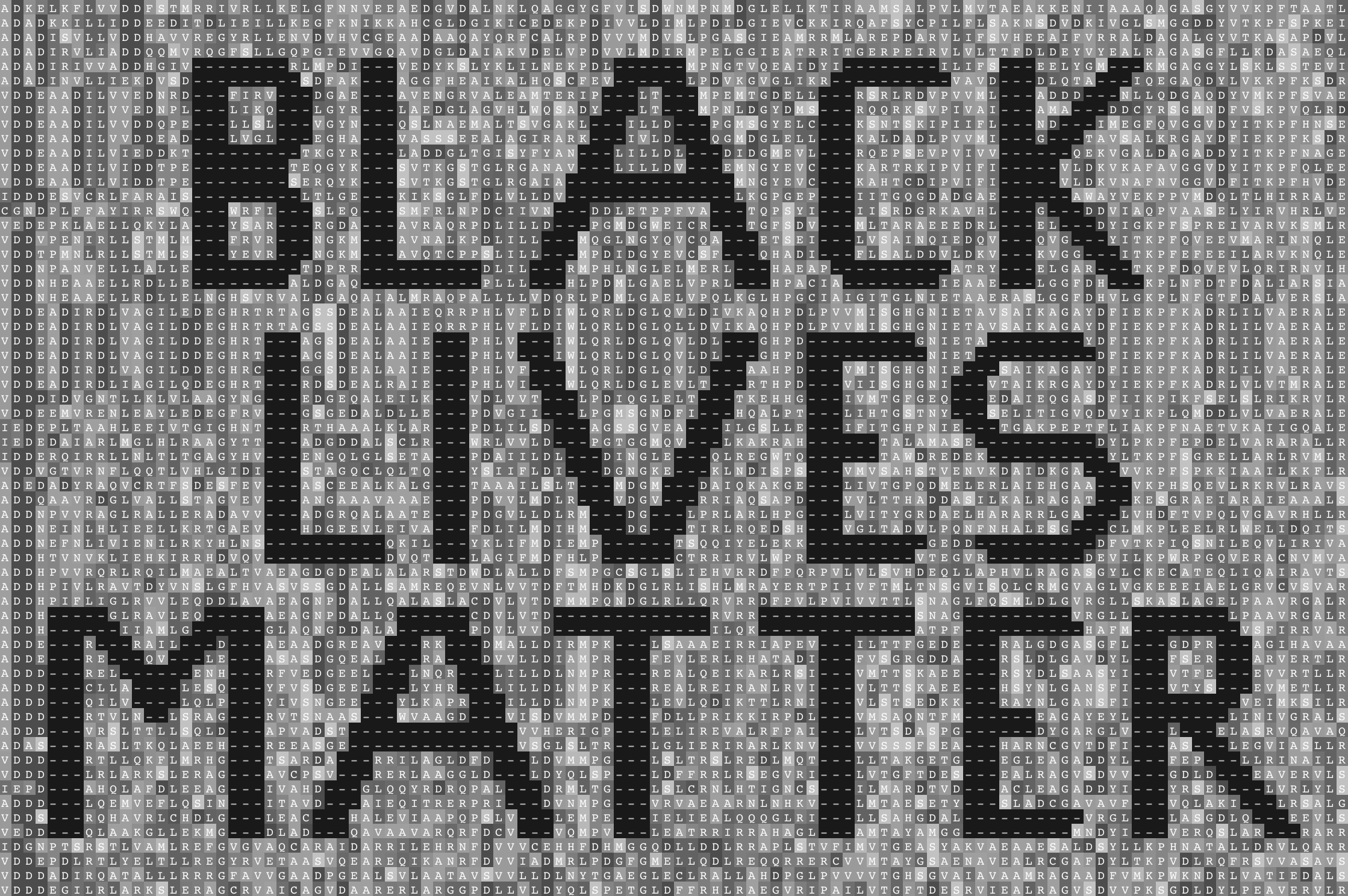 Multiple sequence alignment represents a powerful method to unify seemingly diverse biological sequences and considered as one of the most widely used approaches in bioinformatics. By taking into account evolutionary events such as mutations, insertions, and deletions (that appear as hyphens), multiple sequence alignment, in its original form, symbolizes diversity.
Here, we use grayscale to represent a hypothetical multiple sequence alignment with systemic deletions to remind ourselves of the inEQUALity that exists in our society and to recommit ourselves to eradicating it wherever it is found.